20
Interior Color Trend Forecast for 2023
From fresh and bright to cozy and cocooning, classic country to modern Scandinavian, 2023 is moving away from monochromatic grays and beiges to re-imagined neutrals with classics inspired by nature such as greens, browns, reds, and blues remaining as popular as ever. Think fiery reds, calm greens, saturated blues, and yes – even a touch of magenta! – this year.
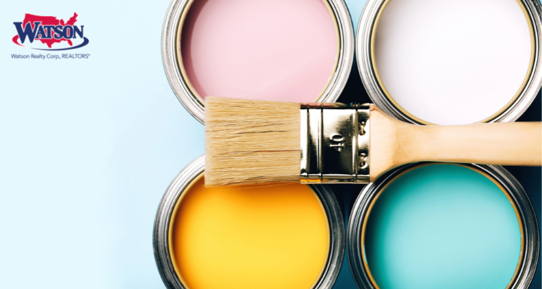
So get out your color swatches, paintbrush, and work clothes and read on to find out what your walls are craving!
WARM BEIGE / GREIGE
Yes, yes, we still love our neutrals! And we're seeing a spectrum of them take center stage like earthy browns, mushroom greys, and warm, creamy beiges in all their glorious hues. This year, especially in bedrooms, warm beige creates a restful ambiance and a sanctuary in which to escape. Think of it this way: nothing beats a bowl of nurturing, cozy, warm porridge on a cold winter's day, right? Now imagine an earth tone with just a hint of underlying grey on your walls creating a relaxed feel, enveloping you in tranquil dreaminess, evoking vibes of a cloudy sky. Inherently calming, greige and beige hues work well paired with soft terracotta or deep red tones, adding depth and warmth to any room.
Recommended colors:
Benjamin Moore "Revere Pewter"
Sherwin Williams "Agreeable Gray"
Behr "Campfire Ash"
PISTACHIO / PALE GREEN
Dark green has been the interior design frontrunner for many years, but a further transition into softer, muted – almost dusty – greens is the next evolution of this trend. Gentle, almost neutral greens create a seamless connection with nature, perfect for use in a sunroom alongside natural materials like grass-weave baskets and burlap – and we're seeing a lot of this color in 2023. Like a breath of fresh air, pistachio green is an ideal choice for calm, relaxing spaces while its retro vibe makes it a modern, happy, positive shade. And pistachio provides soft sophistication, adding to its allure. Combine it with bright white trim to create a smooth, light, and fresh feeling, or with turquoise or blue to create a fun, energetic dynamic.
Recommended colors:
Benjamin Moore "Budding Green"
Sherwin Williams "Perfect Pistachio"
Pittsburgh Paints "Pinch of Pistachio"
DARK CHOCOLATE BROWN
Remember the 2008 trend where everyone painted their interiors chocolate brown? We sure do! Well, brown is back and it's looking better than ever, bringing an earthy – yet sophisticated – tone to any interior. Brown rooms are full of drama while still providing a comforting and grounding appeal as they put everything else in a good light. Strong, warm, and sultry, brown plays well with green, blue, gold, copper, brass, white, and even other shades of brown/beige.
Recommended colors:
Behr "Roasted Nuts"
Benjamin Moore "Appalachian Brown"
Sherwin Williams "Porpoise"
PURPLE / LILAC / LAVENDER
No color commands a room quite like purple! Whether it's a beautiful lavender or a high-gloss plum, the ambitious color makes a daring statement that is not for the weak of heart. Purples are romantic, peaceful, and luxurious and a little fun fact: purple has historically been associated with wealth and royalty. Lavender in particular evokes thoughts of growth and springtime but with its youthful and creative vibe, you can really use this color anytime! Saturated purples will infuse your space with energy and vigor; paler shades such as lavender or lilac will create a tranquil atmosphere. Combinations abound as the royal color pairs well with all shades of green, from light mint to vivid lime to deep forest green.
Recommended colors:
Benjamin Moore "Spring Iris"
Farrow & Ball "Brinjal"
Benjamin Moore "Black Raspberry"
MAGENTA PINK
Pantone announced their Color of the Year for 2023 to be Viva Magenta 18-750, a bold and vibrant shade that is powerful, energetic, and magnetic. The color gives rise to feelings of excitement and passion and is sure to bring a touch of boldness to any project. Some call it 'Barbiecore' which is defined as anything that references the world of Barbies, but hot pinks have been working their way back into homes for a while. This bright, bold, daring shade makes a strong statement when used as the main color in a room, but if you aren't sure about using it on your walls, try it on smaller areas such as wainscotting or on kitchen cabinets so as not to dominate the space. Still not sold on painting a room magenta? How about introducing the color with a couple of throw pillows or a cozy blanket to add a little intrigue to a room?
Recommended colors:
Benjamin Moore "Peony"
Benjamin Moore "Drop Dead Gorgeous"
Sherwin Williams "Cerise"
DEEP RED
Deep, earthy reds are having a revival this year as the hue has a luxuriousness which elevates any space, and when combined with complementing colors, works well in a variety of settings. Go fiery with a spirited, flame red, and bring joy and warmth to any room or try a deep, moody merlot for instant depth and drama. Pair with lilac for a soothing and comforting atmosphere or cerulean blue for a bolder, vivid, and striking statement. Not sure you want to go all red? Try it on a smaller scale by painting wall paneling or your front door for a bold pop that conveys fun and energy. In a nutshell: Go RED or go home!
Recommended colors:
Benjamin Moore "Tomato Tango Red"
Farrow & Ball "Incarnadine"
Pittsburgh Paints "Red Gumball"
Benjamin Moore "Heritage Red"
DARK BLUE
Blue comes into color trends every year, but this year, we're embracing darker, more daring and dramatic shades. The boldness and warmth found in blue creates a gorgeous – almost stately – background for paintings and artwork, but if you're nervous about using a bold blue, start your transformation in a mudroom or small bedroom. Contrary to the myth that white paint makes a room look bigger, richer colors work well in such spaces as they tend to make walls "disappear." An inky, dark blue inspired by midnight skies is a spiritual color, both glamorous in candlelight and perfect for creating intimate spaces. Pair with brass accents to increase the elegance factor and add neutral accessories and details to really make the room pop.
Recommended colors:
Farrow & Ball "Hague Blue"
Benjamin Moore "Hale Navy"
Sherwin-Williams "Dark Night"
JADE GREEN
Touches of this jewel tone are popping up in interiors everywhere as it's inspired by the natural color of the gem itself and can be applied to both tranquil and striking aesthetics depending on how it's used. Jade works well as the lead color in a modern bedroom or bathroom as it has an air of coastal chic and pairs well with neutrals and terracotta for an understated scheme. Jade is also beautiful when combined with salmon because it creates a luxurious, slightly feminine flair or with navy blue, for a deep, dramatic feel.
Recommended colors:
Benjamin Moore "Polar Jade"
Farrow & Ball "Lafayette Green"
Magnolia Home "Aspen Leaf"
Benjamin Moore "Rainforest Foliage"
RUST
Pale pink a.k.a. blush had a big moment in 2022, but rust is taking over this year as its less feminine counterpart. Rust plays into a modern color palette and we love it for its combination of earthiness and decadence as it has the values of three colors combined: red, brown, and orange. While often associated with the 1970s (remember your grandmother's rust-colored shag carpet anyone?), today's rust is romantic, refined, and warm as it evokes the quintessence of fiery sunsets, southwestern deserts, and warm cinnamon toast. The rich neutral is a natural companion for other earthy shades such as Dijon yellow, sand, and chocolate brown but also pairs well with teals and greens. Rust softens any space, making it cozy and welcoming, so paint your living room or even your front hallway rust today!
Recommended colors:
Benjamin Moore "Rosy Peach"
Pittsburgh Paints "Rusty Red"
Pratt & Lampert "Brick Dust"
When painting any given room, remember to use positive and uplifting tones that impact your mood every time you walk into the space, but don't be afraid to get brave with color. Take some chances! When making your decision, remember that it's all about how the color makes you feel and ask yourself what mood or aesthetic you wish to create. Dramatic and moody? Cozy and cocooning? Bright and fresh? Perhaps you want to feel glamorous? Once you've decided, grab some paint swatches and start painting. 2023 is the year to unleash your personality onto your walls!